
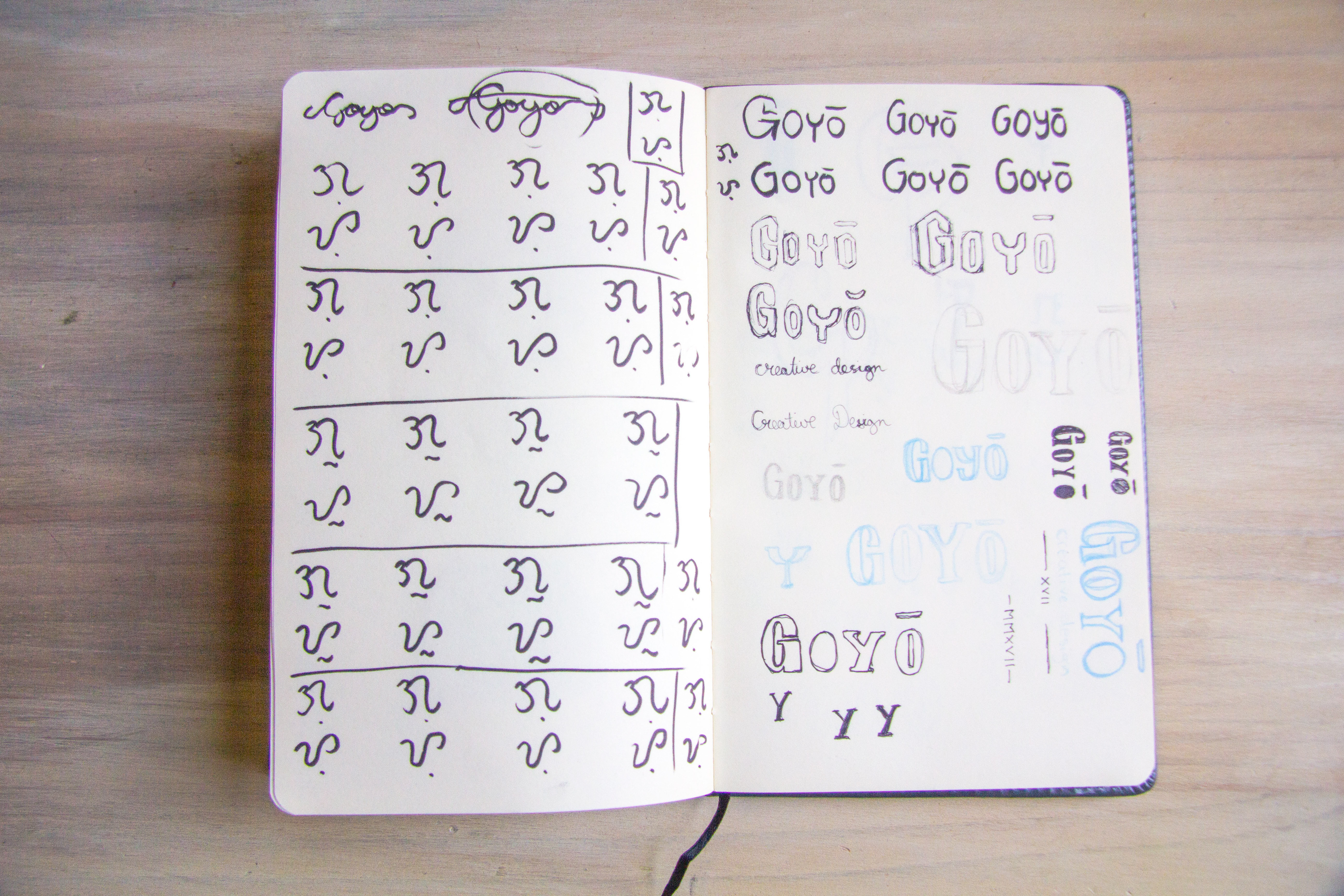
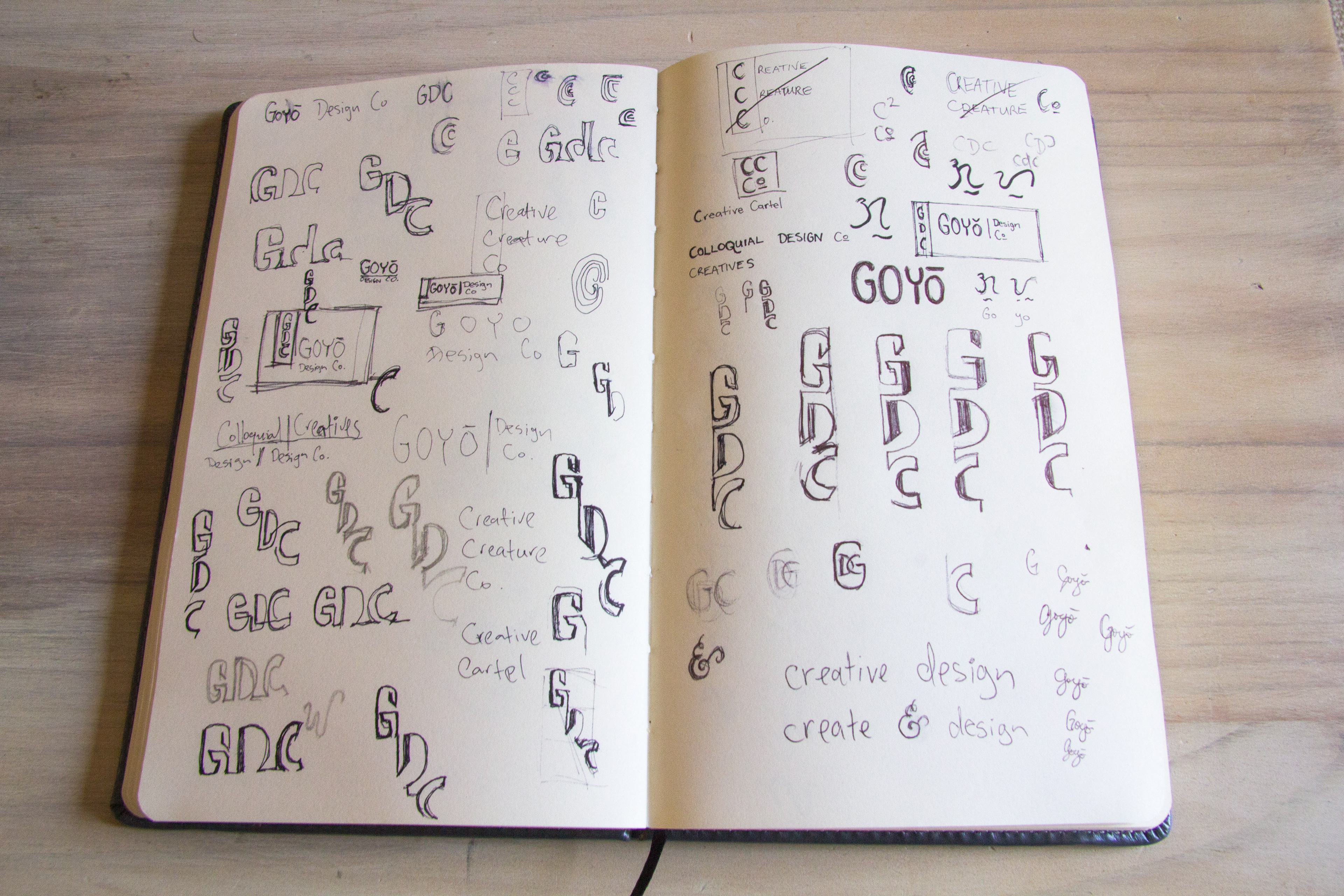
Sketching ideas and digital concepts

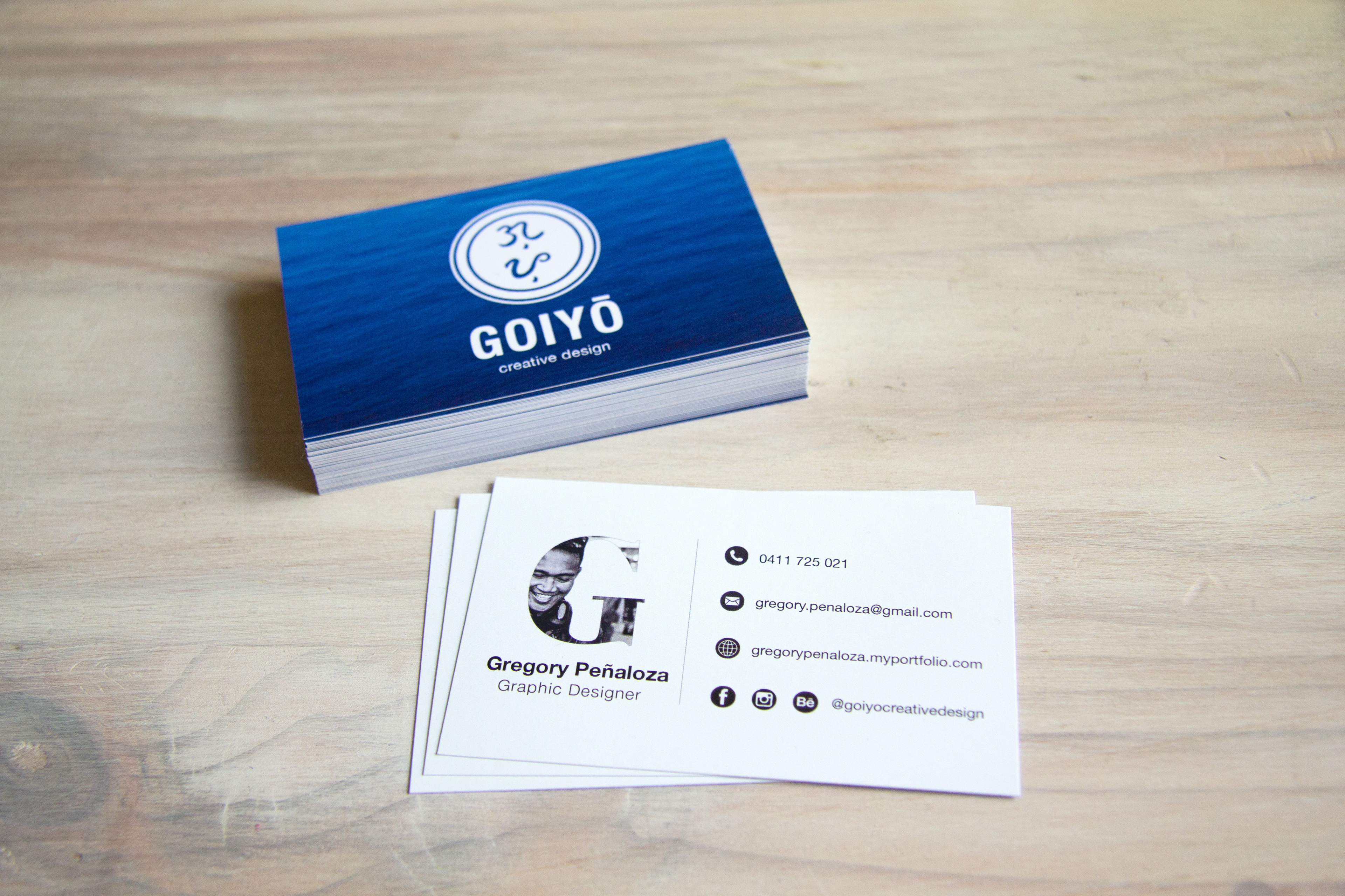
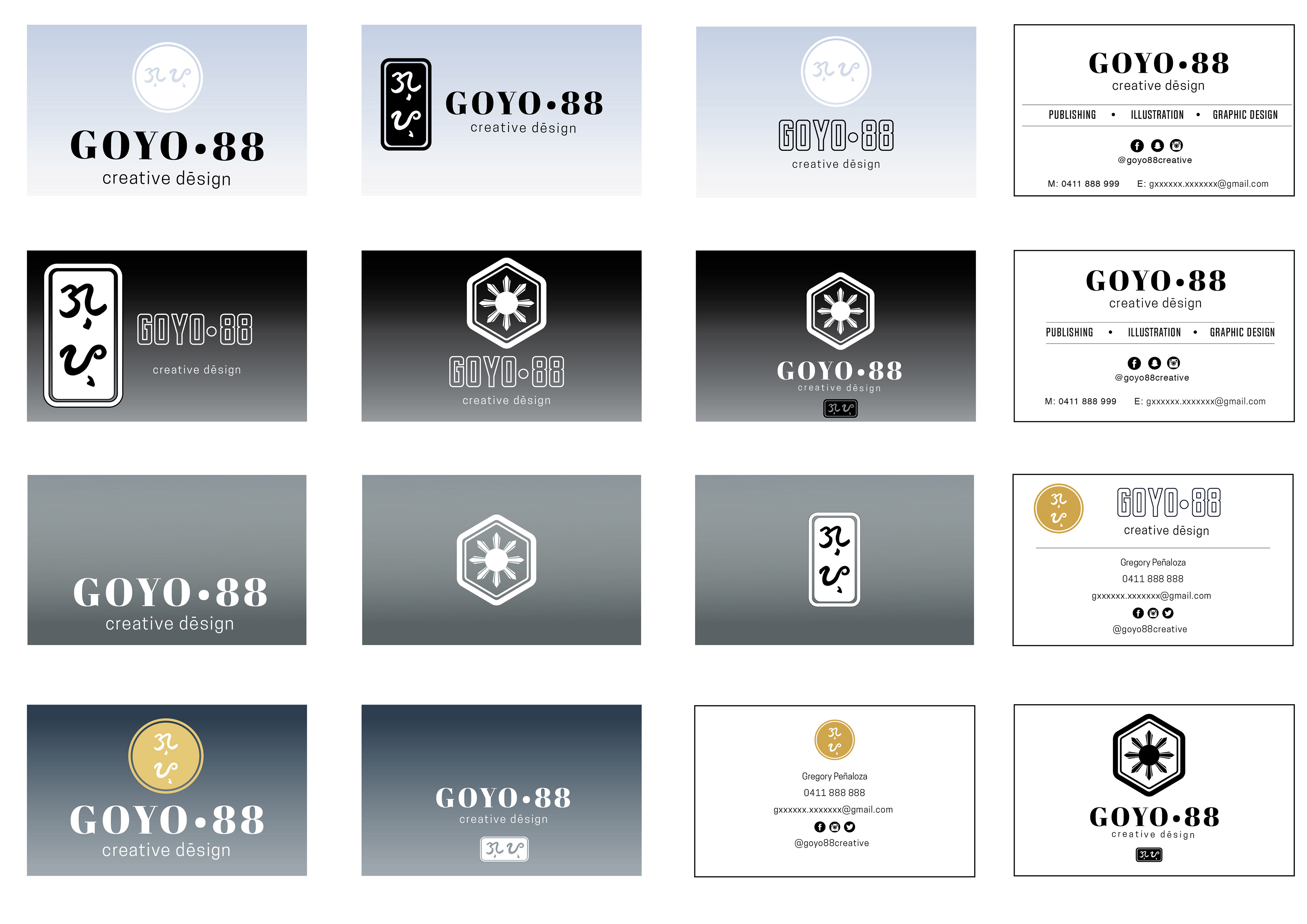
Business cards
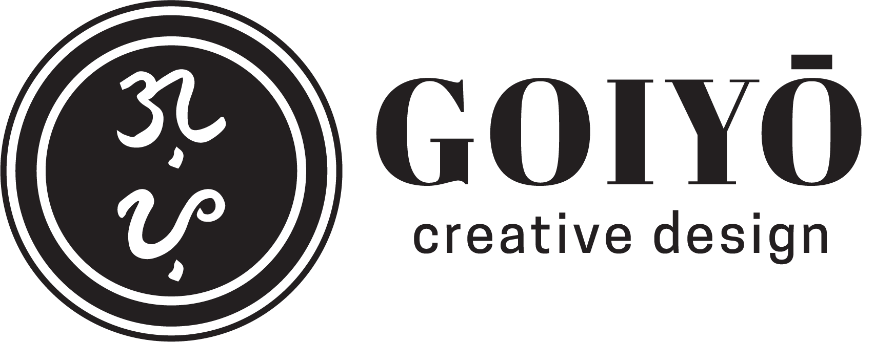
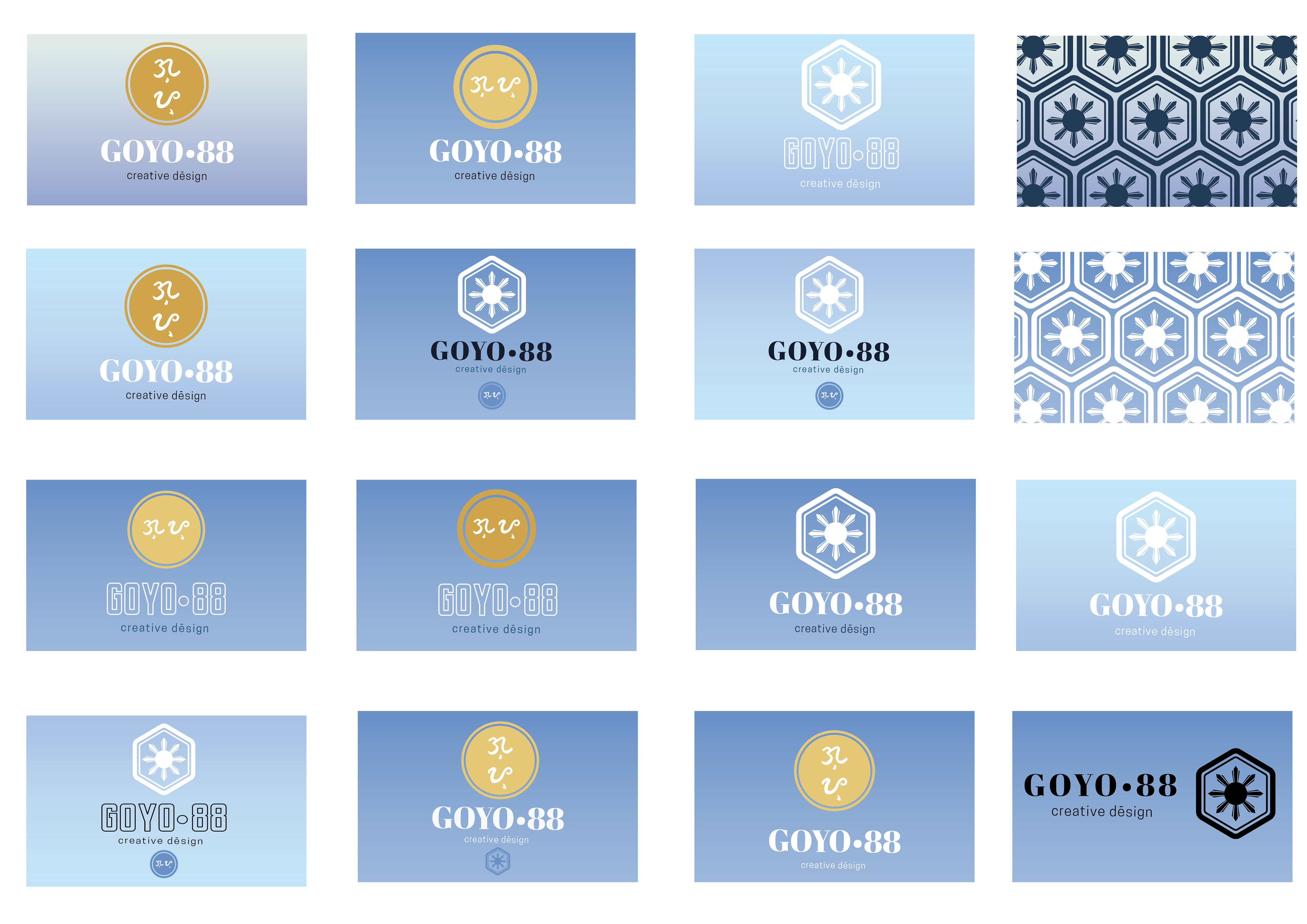
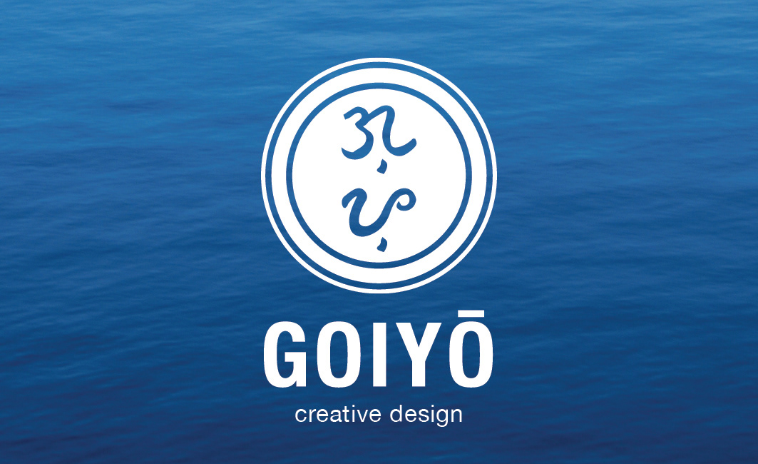
The name and logo were chosen and designed for self branding and promotion. "Goyo" was a nickname I had as a child, the shortened end version of GreGORIO. After much deliberation I settled on the simple phonetic spelling of: "Goi-yo." Initial logo concepts included the sun from the Filipino flag and Baybayin (ancient Filipino) script for “go” and “yo.” A simple colour scheme of blue and white was chosen. The image of a blue ocean provides a sense of tranquility and peacefulness and the vast openess a sense of hope and unlimited opportunity. The white typography compliments the background well and combined together with the natural flow of the Baybayin (ancient Filipino scriprt) characters in the logo - helps keep the viewers eyes engaged.